
26.4. Hierarchical Clustering Examples#
In this section, we will work through two examples of using hierarchical clustering. We will illustrate how linkage affects the final clustering as well as how hierarchical clustering compares to k-means clustering used on the same dataset. Finally, we will discuss the advantages and disadvantages of hierarchical clustering.
A 2-Dimensional Example#
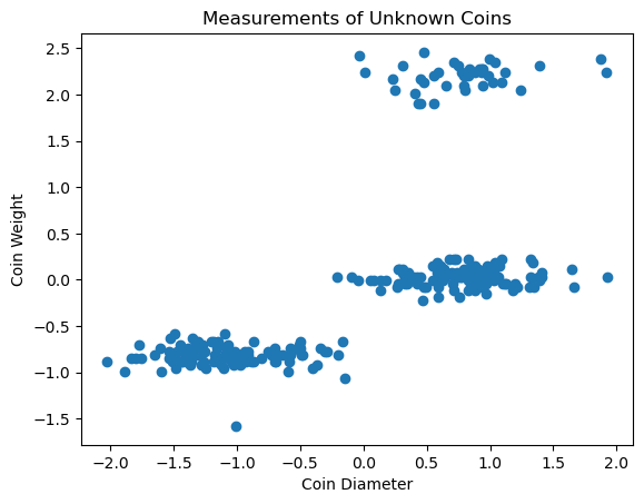
Let’s return to our unknown coins dataset from Section 26.1. Recall that we have measurements of coin weight and diameter for 100 coins.
coins_su.head()
| weight | diameter | |
|---|---|---|
| 0 | -0.735768 | -1.158194 |
| 1 | -0.882571 | -1.426307 |
| 2 | -0.662367 | -1.186729 |
| 3 | -1.579885 | -1.007809 |
| 4 | -0.772469 | -1.252215 |
We can use clustering to group these coins into potential denominations. Because this dataset only has two features, we can easily visualize it graphically and see that there are likely 3 clusters in our data.
plt.scatter(coins_su['diameter'],coins_su['weight'])
plt.xlabel('Coin Diameter')
plt.ylabel('Coin Weight')
plt.title('Measurements of Unknown Coins');
The first step in clustering this data using hierarchical clustering is to import the necessary functions. We will be using dendrogram(), linkage(), and fcluster from scipy.cluster.hierarchy.
from scipy.cluster.hierarchy import dendrogram, linkage, fcluster
We can use the linkage() function to cluster the data. The function takes in a dataset and the type of linkage you want to use as method. You can also change the distance metric used by using the argument method. The default distance metric is euclidean distance. Remember that you don’t need to give a number of clusters for hierarchical clustering. For more information about the linkage() function, you can see the documentation here. For this problem, we will use euclidean distance and complete linkage.
Z = linkage(coins_su, method='complete')
We can use the dendrogram() function to depict our clustering. This function has a lot of options for customization which you can find more information about here. For our purposes, we will mostly use the default options. The function takes in a linkage matrix (which conveniently is the output of linkage()). The argument no_labels can be set to True to keep row labels from being printed at the leaves of the dendrogram. We will set this equal to True to avoid unnecessary clutter on our plot. Lastly, I am setting the argument above_threshold_color equal to k to make the top of the dendrogram appear black so that it contrasts well with the colored clusters.
Note
If you run this code yourself at home, your dendrogram will likely be colored differently from the one here. We have used the function set_link_color_palette to choose colorblind-friendly colors for our dendrograms.
dendrogram(Z, no_labels=True, above_threshold_color='k');

plt.xlabel('Data Points (Each Leaf is a Coin)', fontsize=12)
plt.ylabel('Euclidean Distance', fontsize=12)
plt.title('Dendrogram of Coin Clusters', fontsize=14);
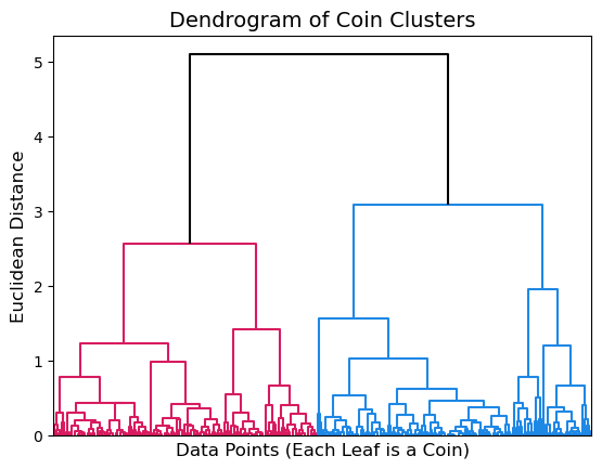
The dendrogram above shows that our coin data has two major clusters depicted in pink and blue. Looking at where these two clusters are joined on the y-axis we can see that they are about 5 units apart, measured in Euclidean distance using complete linkage.
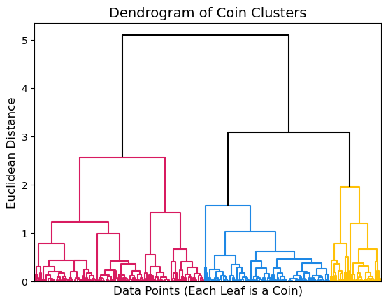
By default, the dendrogram() function will choose a cut point that it deems appropriate for your data and color clusters appropriately. However, you can also customize the plot using the argument color_threshold to change where the cut should be placed. In this case, we know that there should be 3 clusters in our data so we can choose a cut point that gives us 3 clusters. The appropriate cut point seems to be around 2.9.
dendrogram(Z, no_labels=True, color_threshold=2.9, above_threshold_color='k');

plt.xlabel('Data Points (Each Leaf is a Coin)', fontsize=12)
plt.ylabel('Euclidean Distance', fontsize=12)
plt.title('Dendrogram of Coin Clusters', fontsize=14);
We can use the function fcluster() to extract the cluster membership of each row in our original dataset. This function takes in the linkage matrix as well as the cut point for clusters as t and the criterion used to determine clusters as criterion. We will be determining clusters based on their distance from each other and using 2.9 as our cut point. The cluster memberships are printed below.
clusters = fcluster(Z, t=2.9, criterion='distance')
clusters
array([1, 1, 1, 1, 1, 1, 1, 1, 1, 1, 1, 1, 1, 1, 1, 1, 1, 1, 1, 1, 1, 1,
       1, 1, 1, 1, 1, 1, 1, 1, 1, 1, 1, 1, 1, 1, 1, 1, 1, 1, 1, 1, 1, 1,
       1, 1, 1, 1, 1, 1, 1, 1, 1, 1, 1, 1, 1, 1, 1, 1, 1, 1, 1, 1, 1, 1,
       1, 1, 1, 1, 1, 1, 1, 1, 1, 1, 1, 1, 1, 1, 1, 1, 1, 1, 1, 1, 1, 1,
       1, 1, 1, 1, 1, 1, 1, 1, 1, 1, 1, 1, 1, 1, 1, 1, 1, 1, 1, 1, 1, 1,
       1, 1, 3, 2, 3, 2, 2, 2, 2, 2, 2, 1, 2, 2, 2, 2, 2, 2, 2, 3, 2, 2,
       3, 2, 1, 1, 3, 3, 2, 2, 2, 2, 1, 2, 2, 1, 3, 2, 3, 1, 1, 2, 2, 3,
       1, 2, 2, 2, 2, 3, 2, 2, 2, 3, 2, 3, 3, 2, 3, 3, 2, 2, 2, 2, 3, 2,
       2, 2, 2, 3, 3, 2, 2, 1, 3, 2, 1, 2, 2, 2, 2, 3, 2, 2, 3, 3, 2, 3,
       1, 2, 2, 2, 2, 2, 2, 2, 3, 2, 1, 1, 3, 2, 3, 2, 2, 3, 2, 2, 2, 3,
       3, 2, 2, 2, 1, 2, 2, 3, 2, 2, 2, 3, 1, 1, 2, 1, 2, 2, 2, 2, 2, 2,
       3, 2, 2, 3, 2, 2, 3, 2, 2, 2, 2, 3, 2, 2, 3, 3, 1, 2, 1, 2, 2, 1,
       2, 2, 2, 3, 3, 3, 2, 1], dtype=int32)
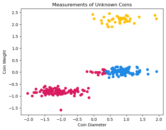
Now, we can use these cluster memberships to color our original graph of coin data based on cluster membership.
coins_clust1 = coins_su[clusters == 1]
coins_clust2 = coins_su[clusters == 2]
coins_clust3 = coins_su[clusters == 3]

plt.scatter(coins_clust1['diameter'],coins_clust1['weight'],color="#D81B60")
plt.scatter(coins_clust2['diameter'],coins_clust2['weight'],color="#1E88E5")
plt.scatter(coins_clust3['diameter'],coins_clust3['weight'],color="#FFC107")
plt.xlabel('Coin Diameter')
plt.ylabel('Coin Weight')
plt.title('Measurements of Unknown Coins');
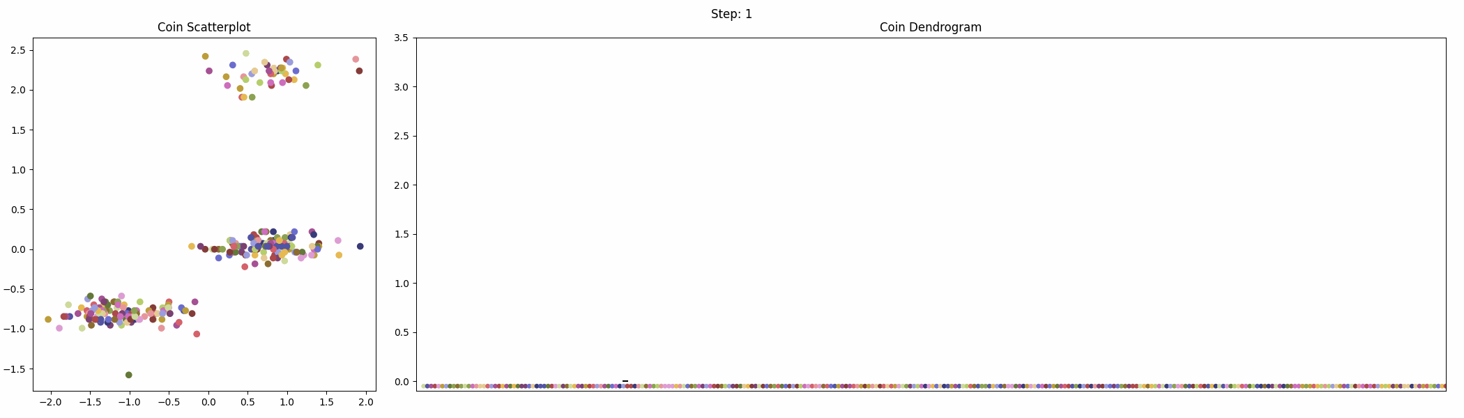
The following animation shows the iterative clustering process with the scatterplot and dendrogram next to each other.
These clusters don’t look exactly as expected. Part of what seems like it should be the middle cluster actually belongs to the bottom cluster. Recall that complete linkage calculates the distance between the furthest pair of points in a cluster. As our groups of points have an oblong shape, some of the points in the middle group are actually closer to the bottom group than they are to points with larger coin diameters in the middle group. This is what causes part of the middle group to actually be clustered with the points in the bottom group. This illustrates the importance of understanding linkage and how it affects the final clustering.
Notice that, as in our k-means illustration, if we hadn’t been able to visualize the data, we wouldn’t have known there should be 3 clusters and might have used the two clusters from our dendrogram as our final clustering. It becomes much harder to visualize our data when we have larger numbers of features.
A Larger Example#
Recall our preprocessed countries dataset from Section 26.2. The data has been cleaned, standardized, and one-hot-encoded. For additional details on this, please return to Section 26.2.
countries_proc.head()
| Density\n(P/Km2) | Agricultural Land( %) | Land Area(Km2) | Armed Forces size | Birth Rate | Co2-Emissions | CPI | CPI Change (%) | Fertility Rate | Forested Area (%) | ... | Official language_Swahili | Official language_Swedish | Official language_Tamil | Official language_Thai | Official language_Tok Pisin | Official language_Turkish | Official language_Ukrainian | Official language_Urdu | Official language_Vietnamese | Official language_nan | |
|---|---|---|---|---|---|---|---|---|---|---|---|---|---|---|---|---|---|---|---|---|---|
| 0 | -0.215644 | 0.818138 | -0.115866 | 0.348798 | 1.264388 | -0.232539 | -0.077214 | -0.280488 | 1.414957 | -1.256779 | ... | False | False | False | False | False | False | False | False | False | False |
| 1 | -0.156441 | 0.115295 | -0.389922 | -0.417215 | -0.788460 | -0.236728 | -0.335232 | -0.389776 | -0.774075 | -0.051855 | ... | False | False | False | False | False | False | False | False | False | False |
| 2 | -0.270901 | -1.088910 | 0.644351 | 0.334160 | 0.450584 | -0.089375 | -0.065003 | -0.316917 | 0.301239 | -1.317025 | ... | False | False | False | False | False | False | False | False | False | False |
| 3 | -0.260376 | 0.321462 | 0.145437 | -0.153746 | 2.081166 | -0.206181 | 0.858093 | 1.516694 | 2.221443 | 0.791591 | ... | False | False | False | False | False | False | False | False | False | False |
| 4 | -0.272217 | 0.640084 | 0.819584 | -0.183020 | -0.269053 | -0.037369 | 0.615715 | 5.936791 | -0.282503 | -0.899936 | ... | False | False | False | False | False | False | False | False | False | False |
5 rows × 192 columns
We can use hierarchical clustering on this data similarly to how we clustered our coins data. But, unlike our coins data, this data has a hierarchical structure which lends itself well to this kind of clustering. Countries are nested within subcontinents within continents. Let’s see if the dendrograms will show these nestings.
First, we use the linkage() function to generate our linkage matrix. We can try this with various types of linkage. Here we will try complete and average linkage since they are the most commonly used.
Z_comp = linkage(countries_proc, method='complete')
Z_avg = linkage(countries_proc, method='average')
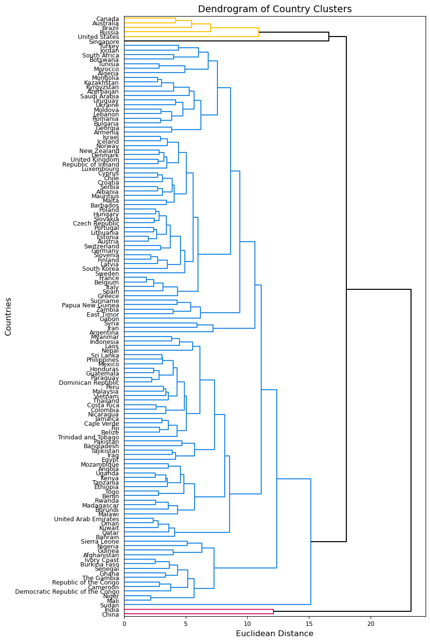
Next, we can depict and compare our clusterings using the dendrogram() function. I will use the labels argument to add the country_names as labels for each leaf and set the argument orientation equal to right to make more room for the labels.
plt.figure(figsize=(8, 16))
dendrogram(Z_comp, labels=country_names.values, orientation='right', above_threshold_color='k')
plt.xticks(fontsize=9)
plt.yticks(fontsize=9)
plt.ylabel('Countries', fontsize=12)
plt.xlabel('Euclidean Distance', fontsize=12)
plt.title('Dendrogram of Country Clusters', fontsize=14)
plt.show();
plt.figure(figsize=(8, 16))
dendrogram(Z_avg, labels=country_names.values, orientation='right', above_threshold_color='k')
plt.xticks(fontsize=9)
plt.yticks(fontsize=9)
plt.ylabel('Countries', fontsize=12)
plt.xlabel('Euclidean Distance', fontsize=12)
plt.title('Dendrogram of Country Clusters', fontsize=14)
plt.show();

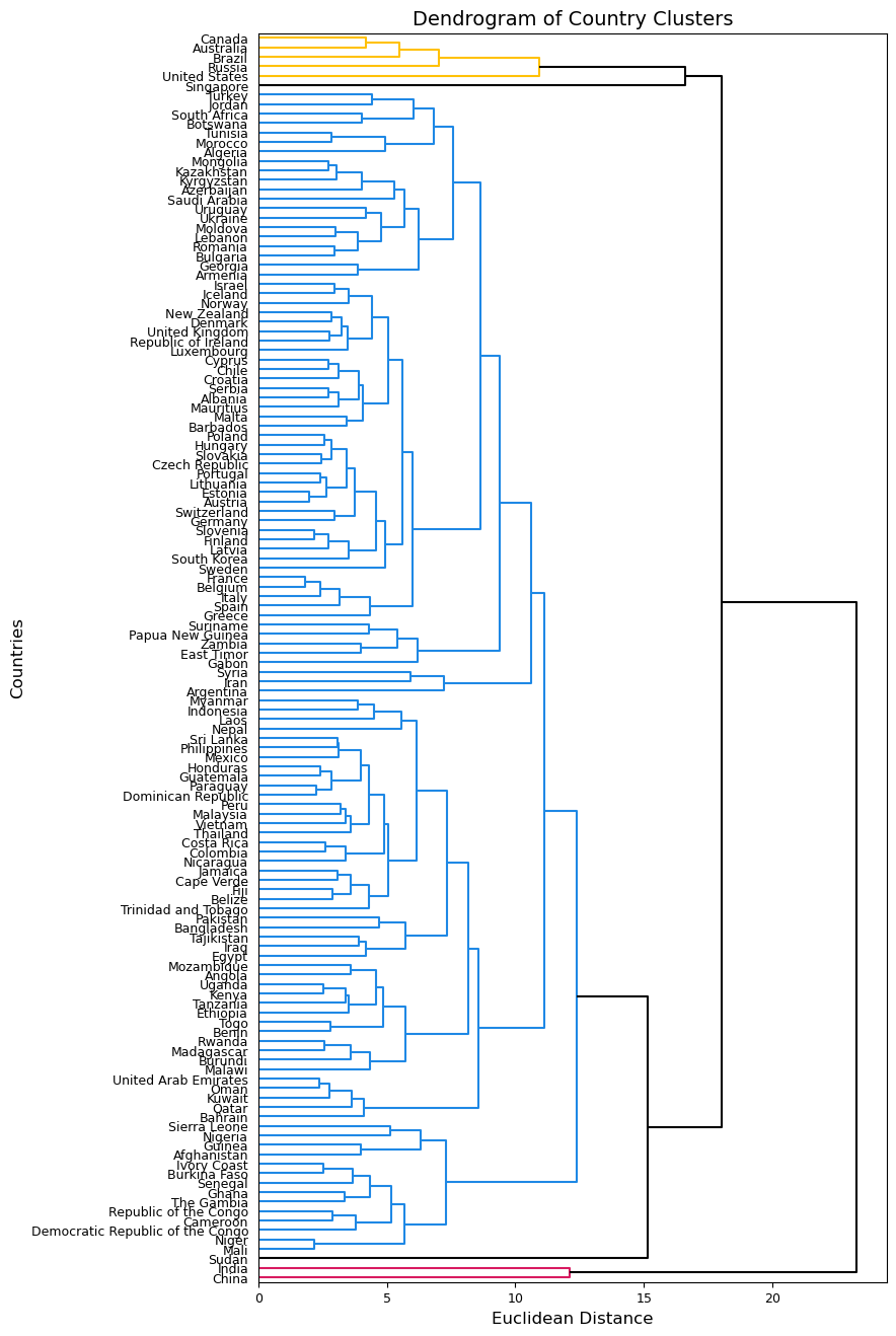
These two dendrograms similarly cluster almost all countries together, but the one using complete linkage seems a bit more balanced so we will use this one moving forward. We know that there should be more clusters than we see in the first dendrogram. We can try a different cut point and see what clusters are formed. Below, I try using 14 as my cut point to achieve 5 clusters.
plt.figure(figsize=(8, 16))
dendrogram(Z_comp, labels=country_names.values, orientation='right', color_threshold=14, above_threshold_color='k');
plt.xticks(fontsize=9)
plt.yticks(fontsize=9)
plt.ylabel('Countries', fontsize=12)
plt.xlabel('Euclidean Distance', fontsize=12)
plt.title('Dendrogram of Country Clusters', fontsize=14)
plt.show();
We can use fcluster() to get the cluster membership for each country.
clusters = fcluster(Z_comp, t=14, criterion='distance')
clusters
array([2, 2, 2, 2, 2, 2, 4, 2, 2, 2, 2, 2, 2, 2, 2, 2, 4, 2, 2, 2, 2, 2,
       2, 4, 2, 1, 2, 2, 2, 2, 2, 2, 2, 2, 2, 2, 2, 2, 2, 2, 2, 2, 2, 2,
       2, 2, 2, 2, 2, 2, 2, 2, 1, 2, 2, 2, 2, 2, 2, 2, 2, 2, 2, 2, 2, 2,
       2, 2, 2, 2, 2, 2, 2, 2, 2, 2, 2, 2, 2, 2, 2, 2, 2, 2, 2, 2, 2, 2,
       2, 2, 2, 2, 2, 2, 2, 2, 2, 2, 4, 2, 2, 2, 2, 2, 5, 2, 2, 2, 2, 2,
       2, 3, 2, 2, 2, 2, 2, 2, 2, 2, 2, 2, 2, 2, 2, 2, 2, 2, 4, 2, 2, 2],
      dtype=int32)
The map below is colored based on these cluster memberships.
Show code cell source
import plotly.express as px

dat = pd.DataFrame({'country_names': country_names, 'cluster': np.array([str(lab) for lab in clusters])})

fig = px.choropleth(dat, locations="country_names",
                    locationmode='country names',
                    color="cluster",
                    color_discrete_sequence=["#D81B60","#1E88E5","#FFC107","#004D40","#47047F"],
                    hover_name="country_names",
                    category_orders={"cluster":["1","2","3","4","5"]})
fig.update_layout(legend_title_text='Cluster Membership')

fig.show()
The figure above shows that clusters are not entirely based on nearness on a map. The hierarchical clustering algorithm is finding similarities between countries that are not necessarily near each other physically (though some are). For example, The US, Canada, Russia, Brazil, and Australia are in one cluster despite being across 4 continents. China and India are their own cluster (as we saw in our k-mean clustering as well). Overall, our hierarchical clustering seems to place most countries into one large cluster and then have 4 smaller clusters of countries that are dissimilar to the larger cluster. For example, Sudan and Singapore each were given their own cluster. This indicates that we may want to look deeper into our data to see what makes these countries dissimilar to our Cluster 2 countries.
Disadvantages of Hierarchical Clustering#
While hierarchical clustering has advantages compared to k-means clustering, namely that you do not have to specify the number of clusters and it provides a useful dendrogram for interpretation, it also has several disadvantages. As we’ve seen, it is very sensitive to the choice of linkage as well as the choice of distance metric. It can also be more time consuming than k-means clustering, especially when datasets are large. Lastly, hierarchical clustering assumes a hierarchical structure in the data which may not make sense for all types of data. Both k-means clustering and hierarchical clustering are useful tools with advantages and disadvantages that should be carefully considered when deciding which to use for a particular dataset or project.